


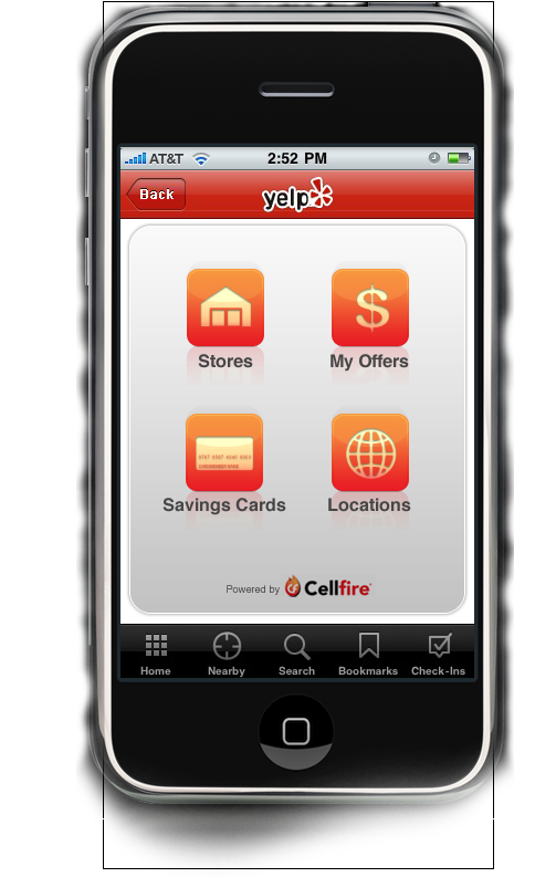

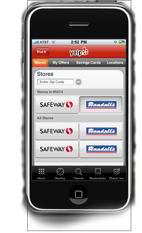
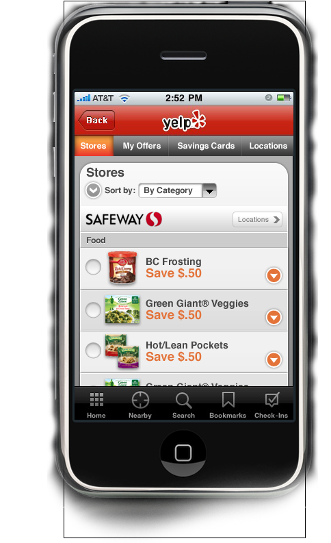
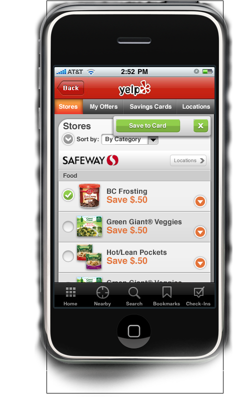
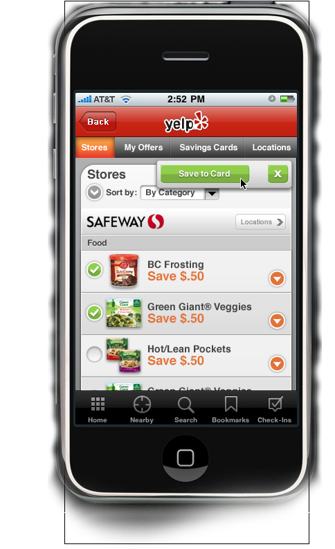
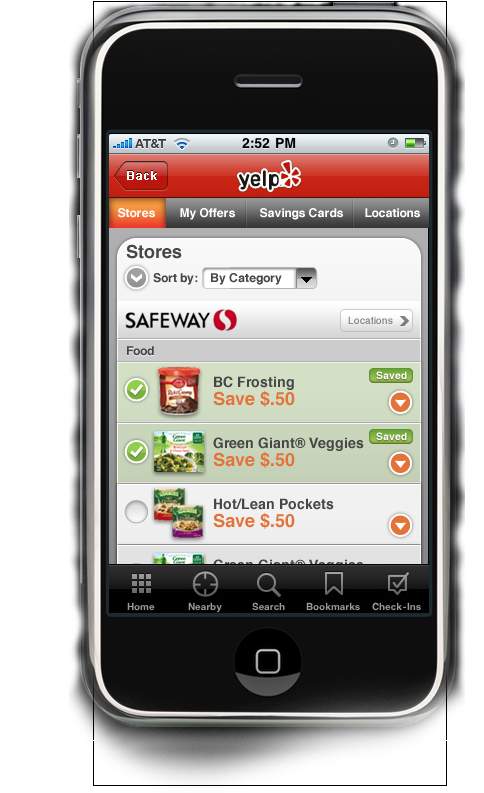

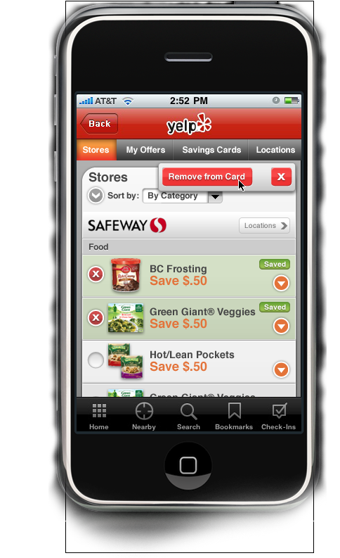

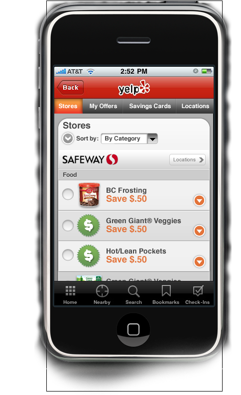
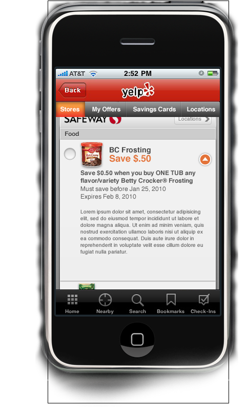
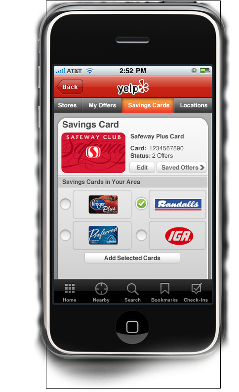
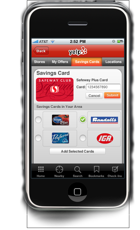
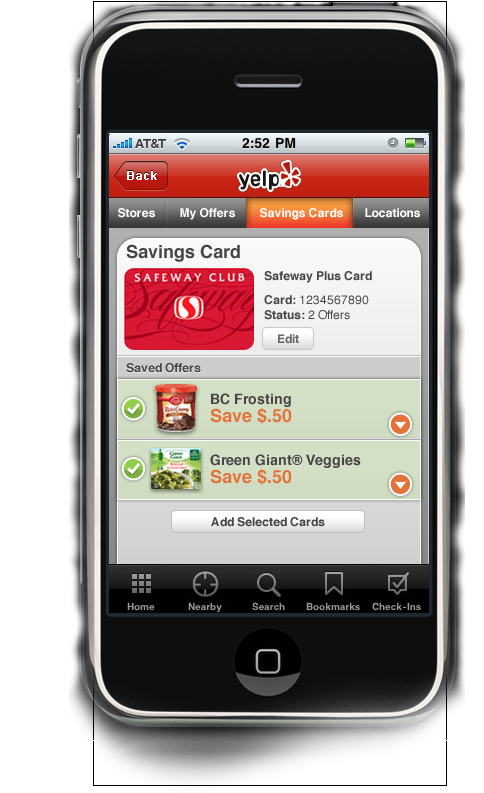
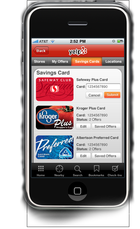
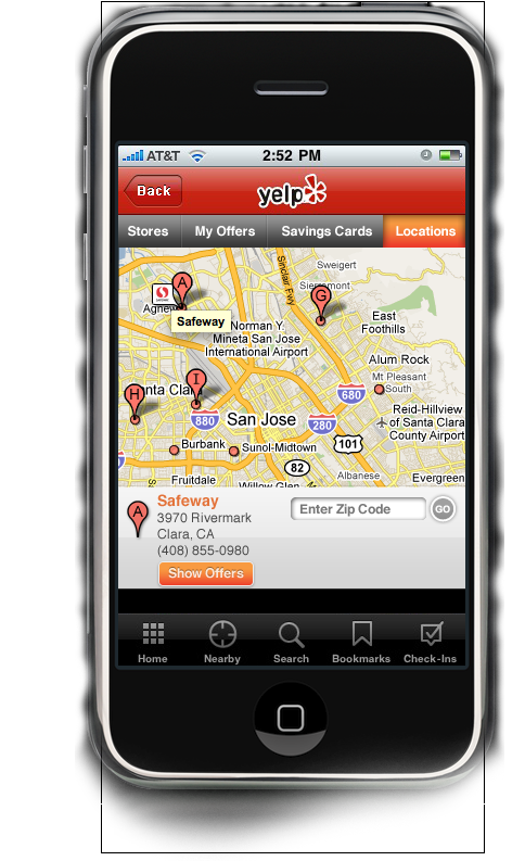
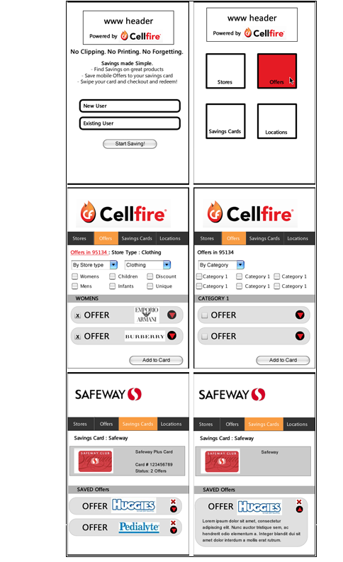
Cellfire's main product offering is rapid delivery of paperless promotions. The coupon technology integrates coupons and promotions within a user's loyalty cards but historically all transactions were based online.
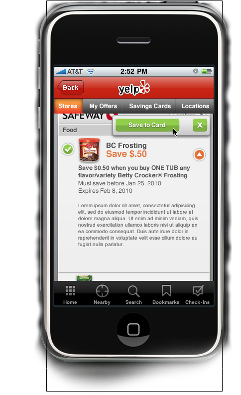
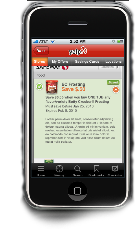
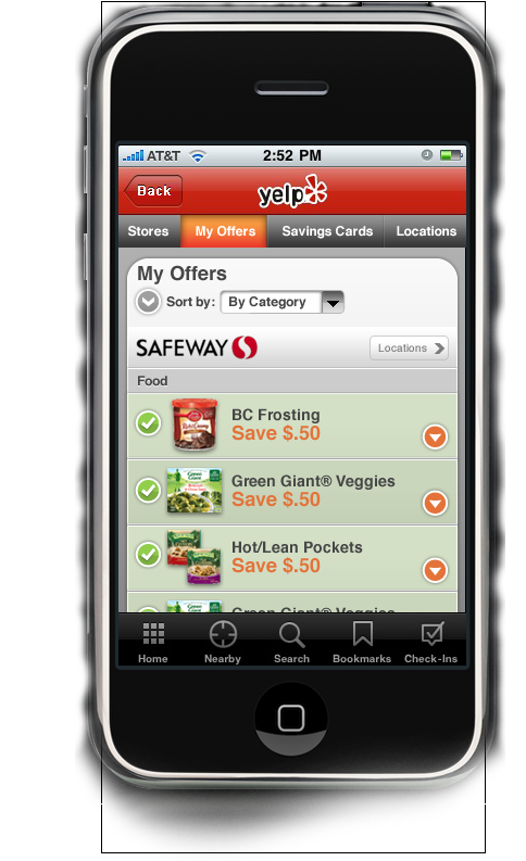
The marketing directors commissioned Mezuki to design the visual language of an HTML mobile web site that was optimized for iPhone/Android/WebOS browsers as well as other full HTML phone browsers such as WinMob, BlackBerry, and high-end java and brew devices. The challenge was to design a Cellfire-branded interaction framework, but one that is neutral enough to integrate into the framework of partnership sites.
Mezuki took a leadership role in the evaluation of existing marketing pieces to ensure a branded, consistent look and feel. Mezuki designed a comprehensive visual system that included the standard framework, the common elements library and the complete features library from requirements through to deployment.

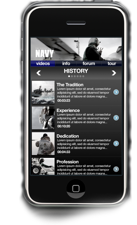
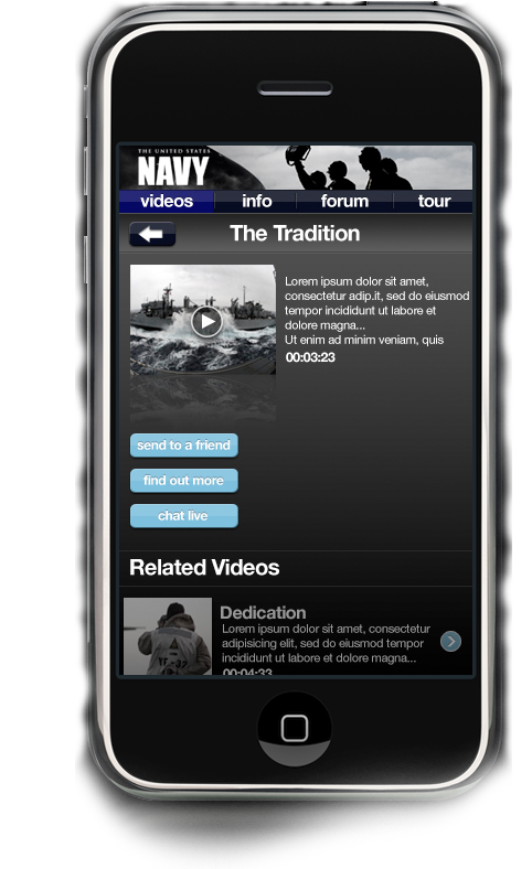
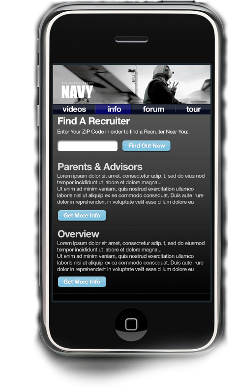
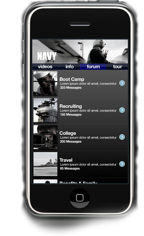
Mezuki took the unique opportunity to answer a highly coveted RFP circulated by the US Navy. Mezuki played an active role in defining the common user touch points that could increase recruitment and enrollment among African Americans and Hispanics.
Mezuki produced a campaign that included an in-language microsite; a community site that featured message boards and other social networking features that enabled communication among the enlisted and family and friends; a MySpace page to target the desired target of males/females between the ages of 18-34; and a mobile application prototype that allowed anyone to witness the true nature of a day in the life of the Navy.

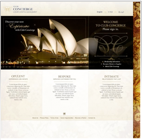
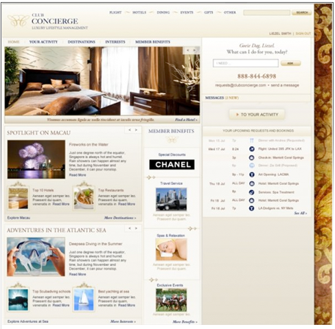
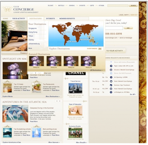
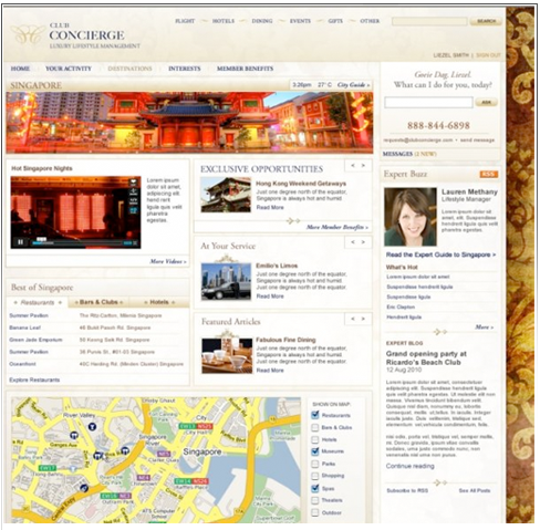
The Cooper team identified the technical objectives of the new concierge system: the system must integrate with sales contact CRM database; must incorporate marketing content such as concierge Best-Of blogs, attraction reviews; a booking engine, a message center and more.
The team interviewed stakeholders in over 10 major cities including Dubai and Moscow to inquire on everyday operations and identified touch points betwee Concierge and clientele.
Mezuki collaborated with Interaction Designers to define primary & secondary personas; defined experience attributes of product; designed visual studies and archetypes for hero screens; developed a unique visual system including icons, common elements and suggested other brand elements that evoked luxury in a visual language that spoke to many cultures, worldwide.
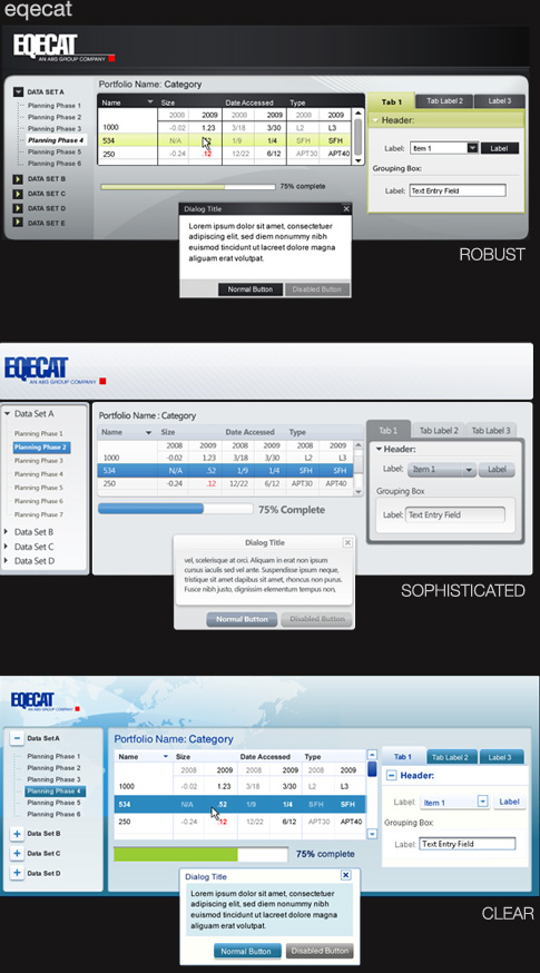
Eqecat looked to Cooper to re-think the user experience of software that models natural disasters for insurance underwriting. Eqecat also sought an exploration of several unique visual directions for the site redesign. Mezuki created a series of design languages that took the root of brand attributes to evoke the design directions.
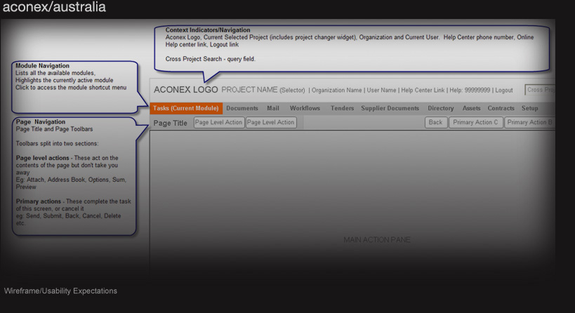
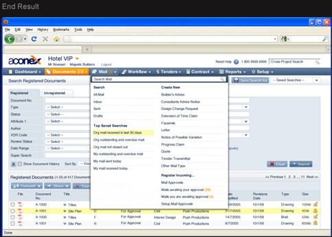
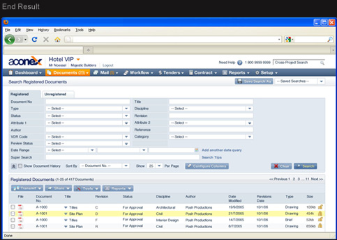
Aconex is an Australian-based company that specializes in project management software for the construction industry. The company sought a current, modernized visual design for their online application that is utilized on a daily basis among project managers, architects, coordinators and vendors.
Mezuki collaborated with Senior Interaction Designers and Project Leads to interview key stakeholders in more than five different time zones to ascertain their visual design aspirations. The final design directions took cues from experience/brand attributes that resonated well with the business objectives and product personality traits.
The selected designs were applied to hero screens, which were then passed on to the development team.
A concise style guide consisting of common elements, icon libraries and color palettes were produced as a blueprint to integrate the new Aconex visual design.

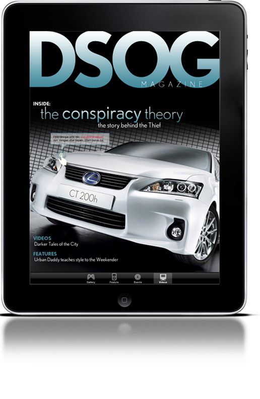
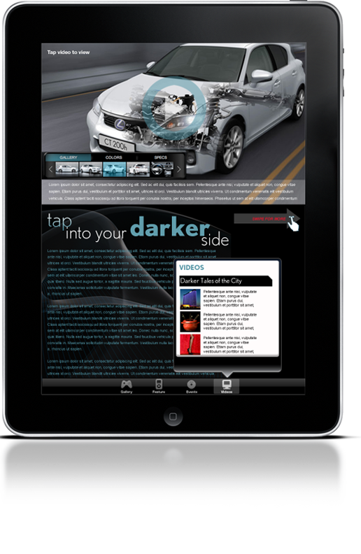
Lexus sought Mezuki to design a series of touch screen iPad archetypes to pitch the concept design within the internal marketing and sales departments.
The resulting concept design fit strategically and visually within the successful general market campaign, Darker Side of Green, established by Lexus and the incumbent agency, The Attik.
Mezuki was able to design within time constraints as there existed a familiarity with iPhone and iPad best practices and UI guidelines. The hero screens combine information and rich media that were auto-specific and editorial-driven to increase trust and loyalty among existing and prospective Lexus automotive drivers.

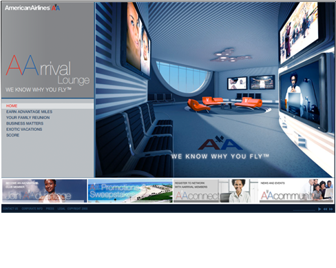
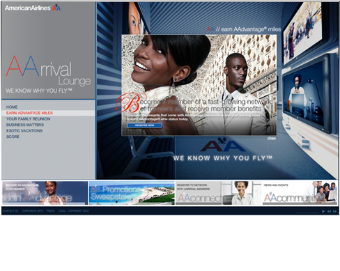
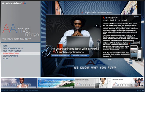
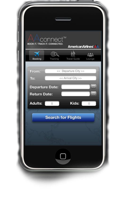
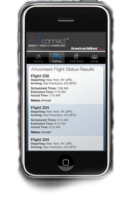
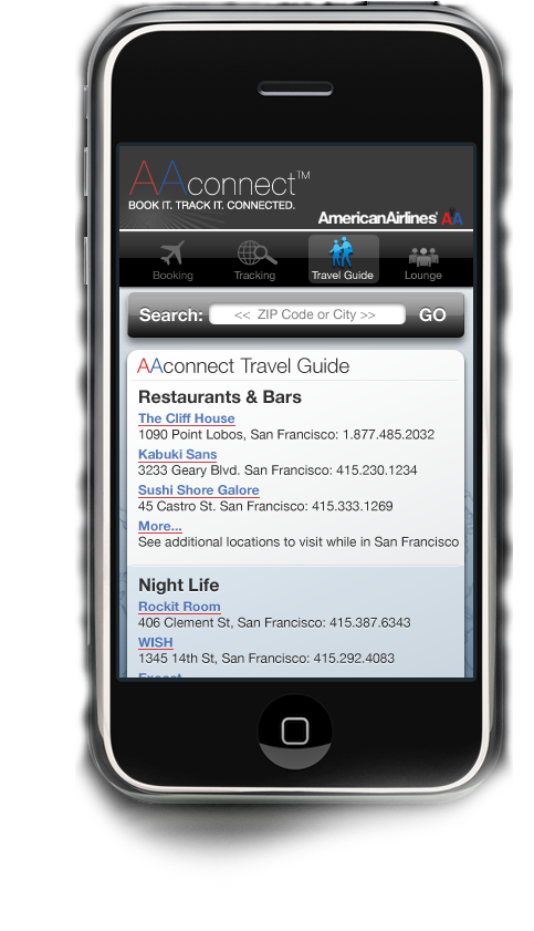
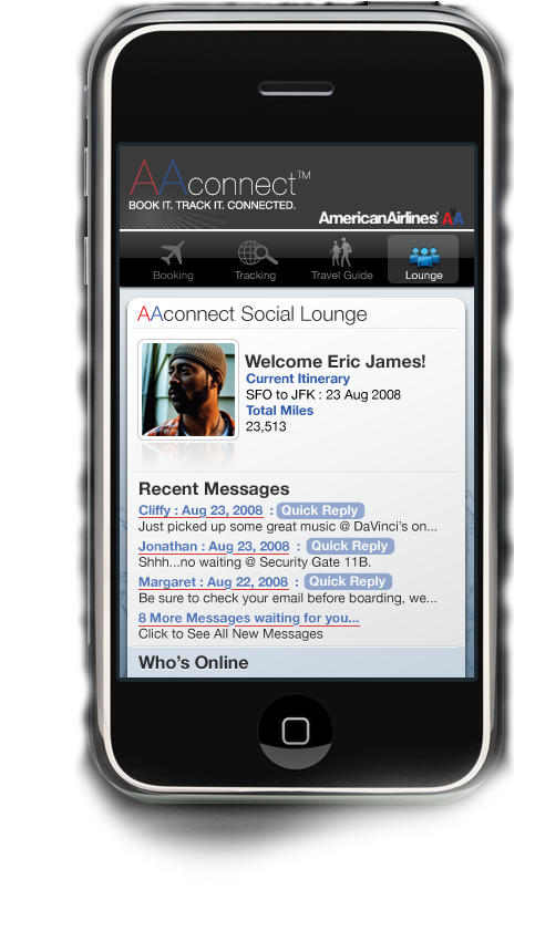
American Airlines sought a sophisticated visual design for their highly affluent African - American class of business travelers, but one that remained in-line with the existing brand of the long-lived airline.
The website had to include culturally-relevant content modules with interactive pieces that stimulated visitors to learn more about exotic and relevant destinations Mezuki developed a social networking ecosystem in conjunction with a booking engine to propel frequent flyers to learn personal anecdotes to drive bookings.
Mezuki built a team of 3D artists, sound composers and flash animators to render a virtual lounge that housed interactive elements to stimulate a user's engagement and ideally, their desire to visit exotic destinations.
The resulting campaign included a high-fidelity prototype of the digital experience from the American Airlines site to the smart phone experience.